If you want to be a successful business, you’ll need more than just a great product or service. You’ll need a crisp, well-functioning website to get your message out and serve as a source of lead generation. So what are the things that keep your business website from working well and getting in front of the people you need it to?
Your Website Isn’t Mobile Optimized
As of a couple of days ago, Google officially started penalizing sites that don’t operate quickly. This doesn’t mean they’re giving mobile-friendly websites a better rank. It just means they’re giving sites that operate poorly on mobile a worse rank.
Google isn’t the be all end all, but it’s close. And the way Google evaluates pages is a good proxy for site performance as a whole.
Google uses a tool called “page speed insights.” It’s loosely related to speed but it involves a range of factors. One aspect is image optimization, or making sure that the file size of your images are small so that they load quickly (especially over phone networks).
It also looks at whether the loading resources are required to render content “below the fold”. When you first load a website you’re only looking at the content “above the fold” — the area that you can see without scrolling down. The web browser shouldn’t be forced to download all the stuff your website — CSS, Javascript, and so forth — that are for content below the fold.
This presents a problem for some content management platforms (CMSs) as the usual themes that are available don’t address delayed loading. So you’ll want some professional customization to get better website performance to receive a higher Google page insight score.
You’re Not Using a Quality Host
Some things fall on the server side. A quality hosting provider will configure their web servers to do things like encourage browser caching so that it only has to send assets once and pages will load faster.
It’s important that your host use a Content Delivery Network (CDN). These are very fast servers whose only job is to quickly transmit static content images, JavaScript, CSS, and fonts. CDNs are also geographically distributed, which means a person landing on your website is getting the content from a server that is the closest geographically and, therefore in theory, the user receives the content faster.
A lot of this is a function of the website hosting provider and the CMS. So there’s some configuration required from the website owner, the agency, or the developer who set up the website for you. For WordPress — and this is a big one — a good WordPress site will update the installation of WordPress a person is using.
Speaking of which…
You’re Not Updating Your WordPress
It’s critically important to apply updates to your WordPress installation.
For most of the website’s we’ve seen get hacked, out of date WordPress is how it happened.
More and more hosting providers throughout the industry are applying updates for WordPress because outdated WordPress is such a liability. If somebody manages to hack a hosted website, oftentimes the hackers will send unsolicited emails, which can land that hosting provider on an email blacklist as a spammer, which in turn impacts the customers of that hosing provider.
Hosting providers are applying updates more, but your hosting provider should also thoroughly check the site before and after. For agencies such as Launch Brigade, that’s a standard part of a managed hosting service contract.

Your Website Is Responsive, But…
Recently, we were doing a proposal for a client whose website was virtually unusable at the smallest breakpoint. Technically, it was responsive. There were breakpoints, and the page layout did change as you made your broswer more and more narrow.
But when you went to the smallest breakpoint, there was no meaningful relationship between the design and layout for the full desktop and mobile views. All context and words were stripped away. It became just a list of images on the homepage, which were supposed to be links but were not apparently interactive.
In this example, your website might not be suffering from a technical glitch, but from a user interaction perspective, everything is broken.
A well designed responsive website should have at least three breakpoints — one for desktop width, one for tablet, and one for mobile.

You Didn’t Do Quality Testing
When a website is developed, the developer should go through a standardized quality testing phase. If you don’t know what your developer or agency’s process is, ask.
Good agencies will go through and use a device farm to do thorough testing on popular devices. The customer who’s purchasing the website should also be doing their independent testing on the website. Every extra pair of eyes helps. You’re paying for this, right?
Things will change over time and new devices will become available, so it’s important to revisit periodically to make sure a website is performing properly on new devices. A CMS update can break some parts of the CSS code that style a website. So website’s need periodic care and feeding just like any other part of a business.
There’s No Thought-out User Journey

If your website is a marketing vehicle, it’s broken if you’re not actually stepping people through the process successfully. No conversions means not enough new business. The site isn’t serving its function.
The design of the website and its content architecture is somewhat objective, and assumptions are being made in the design process. However, those assumptions need to be tested. Marketing is a continuous experiment similar to science, in that it is very rare to get it right out of launch. You need to figure out what is working and what is not working, and then pivot from there.
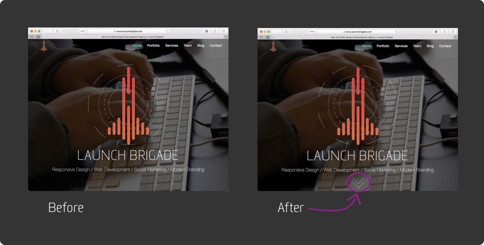
So the people with a successful customer journey are doing AB testing and using tools like Crazy Egg and Google Analytics. Tools like Crazy Egg can provide heat maps and scroll maps, so that you can determine how your customers are interacting with the page. You might find your visitors are missing some part of the content entirely. One site we worked with had a full-screen video above the fold, and people didn’t realize there was more to see if you scrolled down on the homepage. Especially on smaller screen sizes, they only saw the video, so we made an adjustment, putting a visual indicator that the person should scroll down and see the additional content on the page.
After testing this proved successful we were able to get people to view content that was otherwise lost in space. And the problem may have been overlooked if not for investigating with a heat map tool.
What’s Your Next Step?
Whether you’re a national player or a local business, a website is an incredibly valuable tool for your business. So I hope these tips help you make the most of your web presence and online marketing.
Has your business experienced a nightmare? Have you invested in website design and development yet? We’d love to hear your experiences, any extra tips you might have, or anything we can help you with. Reach out to us on Twitter or check out website.
