Launching an AI-driven cloud security startup
Lacework is a tech startup that created an advanced and innovative automated security platform for the cloud. After coming out of stealth mode, they were ready to define themselves to the world. They needed clear communication and a brand that felt effortless and relatable. And Lacework needed it done before a fast-approaching key event — the RSA conference.
Technologies
Wordpress
HTML
CSS
jQuery
PHP
Disciplines
Design
Develop
DISCOVERY
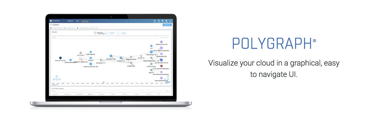
The visual inconsistencies and the dark color of the site were undermining Lacework’s message about ease and security. As more and more people move to services like Amazon Web Services, there’s a concern about security breaches. Lacework’s star product, Polygraph, automates the security. It’s monitoring alerts and reporting.
It also allows you to be quickly alerted to anomalies and then it shows you the sources of the anomalies and what happened and how intruders got in.
Lacework’s existing website had been rapidly developed using Page Builder, which made managing the content difficult. If the Lacework team wanted the same content in two different places, it had to be added separately and manually. So if the team had an article on the news page, which they also wanted to feature on the home page, a team member would have to go into Page Builder and copy and paste all of the content by hand.
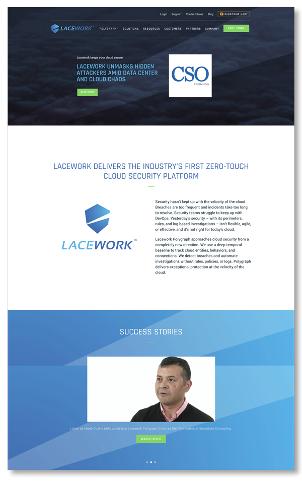
Before
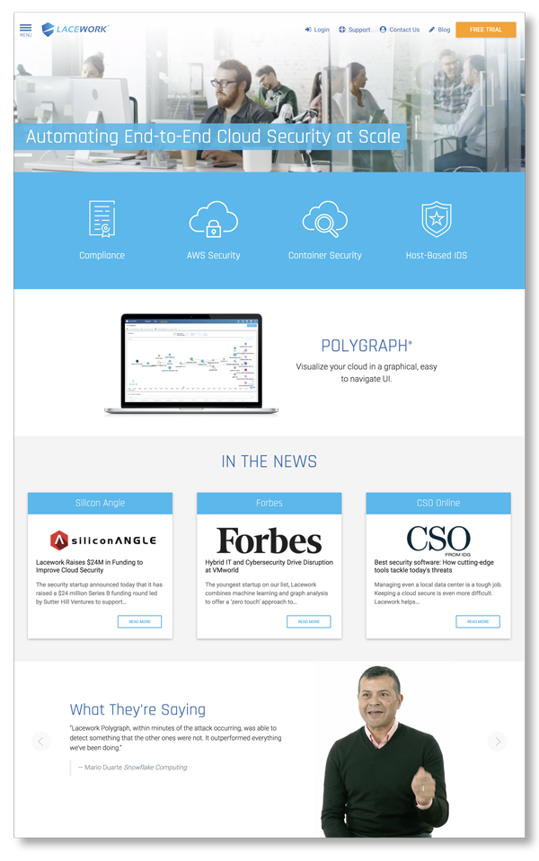
After
In addition to being time-consuming, the process was also creating visual inconsistencies. Styles as well as content had to be managed manually. So each new session of copying and pasting was creating the potential for the styles morph. Every small error in style mutated and replicated endlessly.
We had our team from sister company [Cloud Brigade](http://www.cloudbrigade.com) share their invaluable user perspective. Cloud Brigade works with AWS all the time. One of the main things the Cloud Brigade team told us was that, on the main website, a lot of the useful information about Lacework was buried.
Lacework had a lot of their content on HubSpot, including their blog. They wanted to have all their content under their own roof. So we put together a customized blog implementation and layout and moved the blog content over from HubSpot to their website.
Lacework also wanted to build the site so that it would be SEO-friendly and fit into their planned SEO strategy. So we embedded code into their templates to make sure the content would be easily crawled and indexed by search engines.
DESIGN
Their previous site was very dark. But they wanted to communicate transparency, so we used a lot of light colors and open space in the new designs.
They wanted to get away from the “Danger, Will Robinson!” vibe that a lot of the security sites have.
We started by building a creative brief to ensure we had the right picture of Lacework’s business, clients, and creative objectives. We also tried to stay away from imagery that was too cliché and keep images of clouds to a minimum.
Their users would be C-suite executives, heads of security, and IT managers. This represented a wide range of demographic and psychographic types. So we decided to focus on the benefits of using the product. In particular, we focused on how Lacework’s automated services save people time, which is a premium value for all three of the key user types. With the help of Lacework, leaders can keep their focus on the important questions instead of repetitive tasks or micromanaging.
On the old site, key content was a bit buried or simply didn’t exist. For this round, we decided to make education an important part of the redesign. We put videos upfront showing how the product works and its benefits.
Lacework was getting positive press, and as a new company, that’s a huge asset. So we also featured these articles from external as a fairly prominent part of the home page.
To make it easy for people to try Lacework’s products, we made sure there was a ‘free trial’ call-to-action on every page, including the home page.
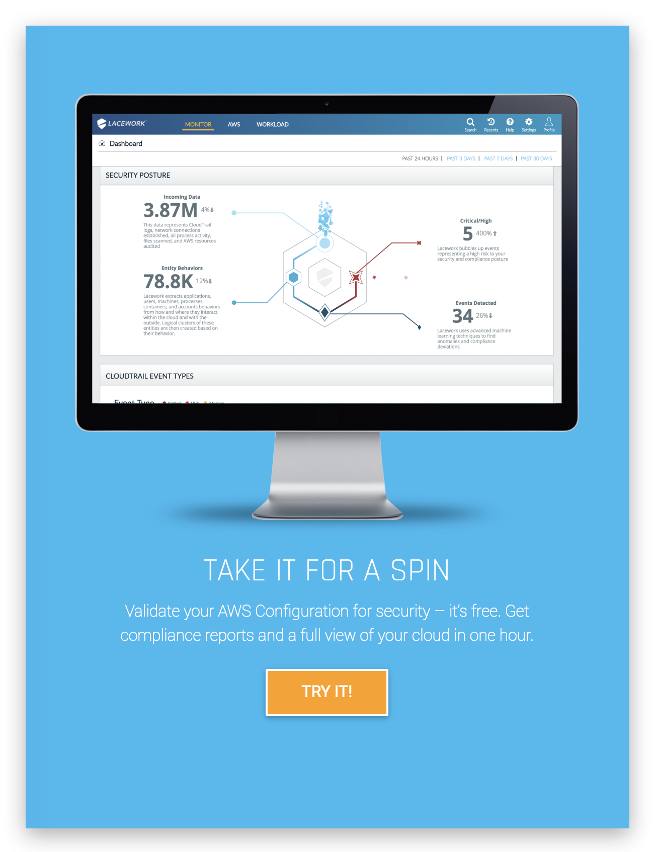
Call-to-action
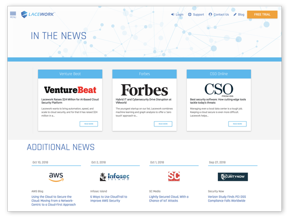
Links to external news stories improved SEO ranking
BUILDING
We started with a the bootstrap-based Underscore UnderStrap theme combined with Material Design to build a responsive site that displays well for tablet, mobile and desktop devices.
As part of our normal development philosophy, we stayed away from plugins or page builders as much as possible. Lacework had already seen some of the problems with Page Builder. And some developers don’t update their plugins, which creates problems when our clients upgrade their WordPress.
Instead of relying on plugins, we did a lot of coding directly into the templates. We knew there was going to be content reused across different parts of the Lacework site. So we created a Resources section. This gives the Lacework team a central place to keep all their videos, white papers, case studies, and so on.
Now, when the Lacework team creates a new page, they can use custom post types to drop in content from the Resources area, allowing consistent content blocks to be reused on any page.
We were able to launch before the conference so that they had that front-facing asset when they were pushing the product out in a new way.
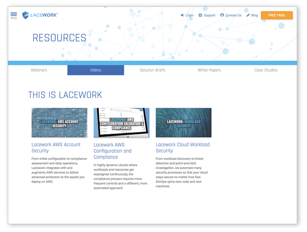
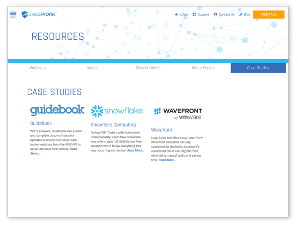
The new resources section improves accessibility to videos, case studies, and other informative and educational materials.
