Helping a green energy movement launch successfully
Monterey Bay Community Power (MBCP) was formed to provide greener energy to the people of Monterey, San Benito and Santa Cruz counties.
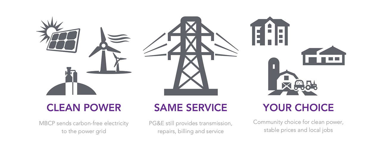
MBCP would be purchasing energy from greener sources, and then supplying it to local citizens. But they wouldn’t be creating or managing any new infrastructure, such as solar panels or power lines. Instead, they’d use the pre-existing power delivery infrastructure, owned and maintained by PG&E. So current PG&E customers were about to be automatically enrolled with MBCP in the spring.
To gain acceptance and continue growing momentum, MBCP needed to let people know the new service was coming and make its benefits clear. MBCP engaged the help of Miller Maxfield PR Agency to help get the word out. Miller Maxfield approached us to help execute the web portion of the campaign.
Technologies
Wordpress
PHP
Bootstrap
HTML5
CSS
Sass
Disciplines
Communications
Content Strategy
Visual identity and branding
Web design
Web development
DISCOVERY
When we first met with the MBCP team, they had a small website that had been aimed at the political allies who helped start the movement. With the service rolling out to the general public in a few months, these political allies were no longer the primary audience. To be successful, MBCP needed to achieve broad acceptance and keep its opt out rate below 10%.
Consumers would be automatically enrolled with MBCP, but if they didn’t recognize MBCP, they might think it was a new charge. MBCP needed to communicate that it would provide greener energy at no additional cost to consumers.
This message was especially important since many area citizens are farmers. These farmers deal with specific economic constraints and they’d be very sensitive to any new energy costs.
Once we understood these communications and public relations objectives, our design goals were clearly framed. We needed to let people know this was a positive change towards green power, at no extra cost to them.
Clear messaging communicated the benefits of MBCP
DESIGN
We spoke to the MBCP team about their stylistic preferences. They told us they’d seen too many websites for similar initiatives that were dull and muted.
The MBCP team wanted to express positivity and energy, particularly through the the use of color.
The MBCP team had a partial brand guide with a logo, colors, and selected fonts. After seeing their brand guide, we advised them to add one more color. The existing guide had two shades of green and a yellow that were very similar. It needed an additional accent color. This third, contrasting color would help certain elements pop out. In a web context, this would help call-to-action and signup buttons stand out.
The MBCP team also wanted something that spoke to their particular geography and identity. The local economy was mainly agricultural, commercial, residential and industrial. So we advised them to use custom imagery of those subjects instead of stock photos.
For the web design itself, we used simple patterns to give the site more texture. To keep things light, we played with the plus and the equal sign, exploring the theme, “Monterey Bay Community Power + you = clean power.”
For MBCP’s About page, we wanted to be sure that, even if visitors didn’t read, they’d look at the page and immediately recognize this as a local initiative. So we included a clear visual of the Monterey Bay and the surrounding counties.
We knew first-time visitors might be curious but not very committed. So we kept the homepage graphically rich to draw visitors in and make sure they stayed long enough to get the information they needed.
We made more information-dense designs for the subpages. That way, after users had learned the key points on the homepage, they could always drill down to learn more.
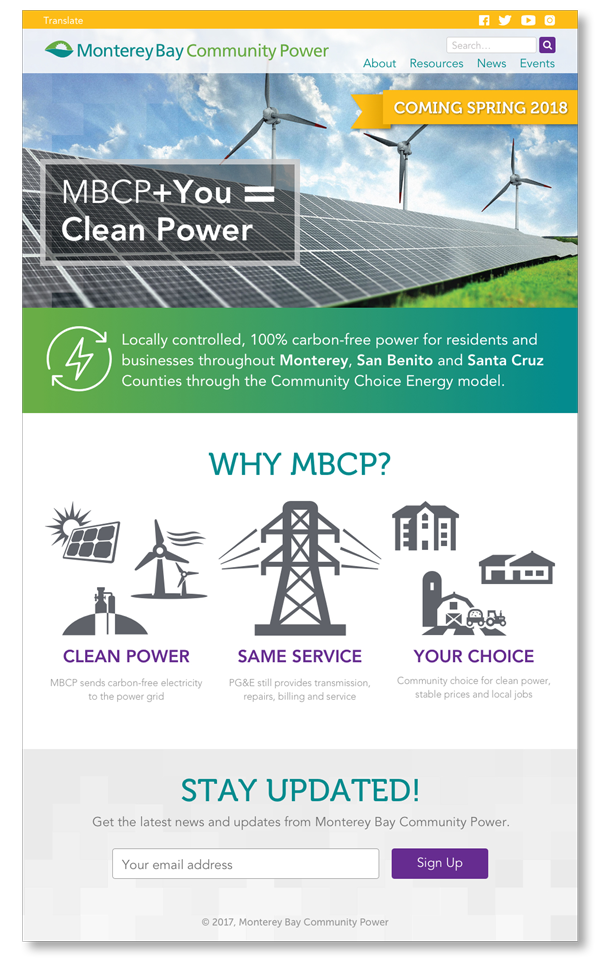
The home page featured clear messaging
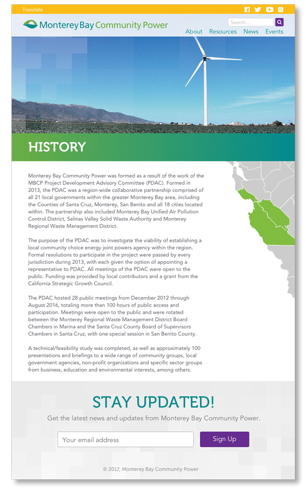
Images and graphics emphasized the local nature of MBCP
BUILDING
To accomplish buildout within MBCP’s tight timeline, Sketch let us produce mockups and transition to development faster.
We used Bootstrap 4 to make sure that the site was responsive and presented well on many different devices of different sizes.
The region also has a heavy Spanish speaking population. So we added a Google Translate integration to make the site more accessible for Spanish-speaking visitors.
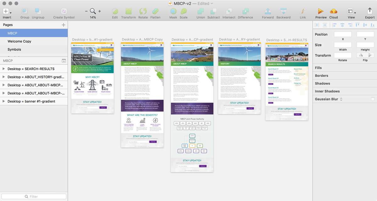
We used Sketch for rapid design prototyping and easy asset hand-off to our developers